Mobile App & Web Development Services Company
Illuminating Screens
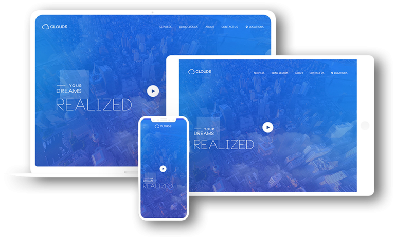
At present, in this dominating digital industry, every customer wants to have the mobile version of their website to increase the availability from user’s point of view. With this, they want various types of designs according to the different devices as well such as one for the laptop, another for the I-phone, another for the I-pad, and so on. Along with it, all the screen resolutions must be compatible as well.
Here at Indi IT Solutions, we would love to design for a number of additional inventions in the next five years.
We, as Indi IT feel that there is so much happening in the field of web designing that sometimes we feel unable to keep up with the endless new resolutions and devices in the field of Web design and development. This way creating a website version for each of the resolution and new device would be quite impossible and moreover seems impractical.
Introducing Responsive Web Design
Responsive web design is a strategic approach which suggests that design and development should respond to the user’s behavior and environment based on screen size, platform, and orientation specifically.
Responsive web design basically helps the users in having a good viewing experience no matter what type of device users are using. You must have noticed as well that recently mobile device ownership has exploded and traditional PC sales have slowed down tremendously and simultaneously the responsive web design has become more important over the last few years as well. So to make this work on other devices as well, you need to make it sure that your site is optimized for mobile by using responsive web design. Moreover, Google is also now prioritizing mobile-friendly sites in its search results algorithm with the help of responsive design as well. Responsive web design is mobile-friendly and moreover it increases visibility on the search engines as well.
A website that adapts to any screen size and also easy to use on mobile, tablet, and desktop with no pinching or horizontal scrolling required can be called a responsive website. It is also necessary to make it sure that it looks great on a mobile, tablet, and desktop or any other device. Moreover, in a responsive website the design automatically adapts to the device in which it being viewed.
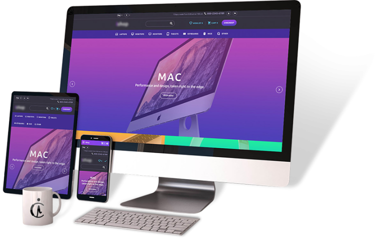
Why do you require a responsive website?
The importance of responsive design is that it offers exceptional optimized browsing experience to the users. Moreover, with the responsive design, your website looks great and works on every device perfectly. On the other hand, if it is not responsive design, then it won’t be easy to view your website and this way you will lose your valuable customers too and in results your business will suffer a lot.
Google’s True Statistics reveals that:
- If your website is not device-friendly, then it is confirmed that approximately 60% of the people will not be staying at your website.
- Besides, if your website is friendly across every device then about 70% of the people are more likely to buy a product or use your service and will result in a positive outcome for your business.
- Moreover, Google always rank a mobile-friendly website above the non-mobile friendly websites in the Google rankings.
The below-written are some of the statistical results to check the average number of global users using the various devices that can really go through your site:
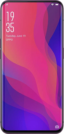
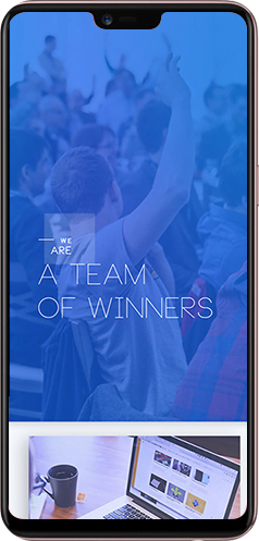
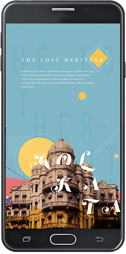
Market research on Most Used Smart Phones screen size 2015-2018





Market research on Most Used
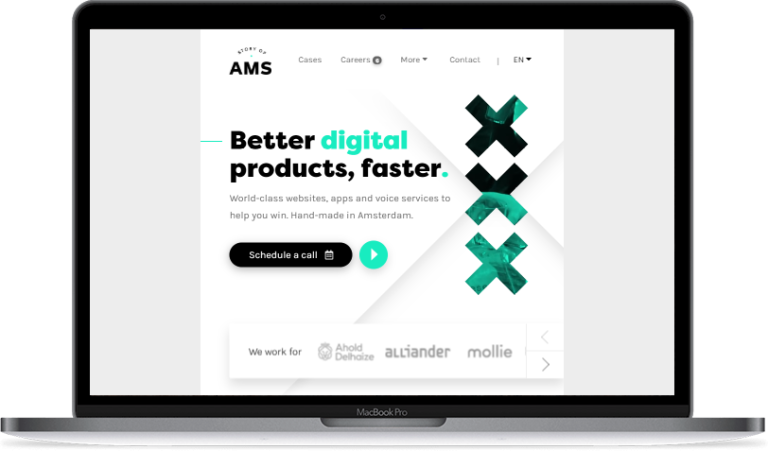
Laptop screen resolution
2015-2018


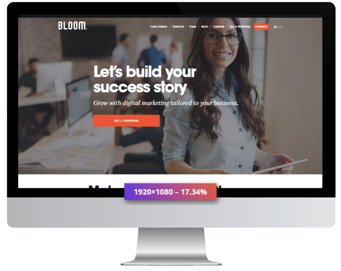
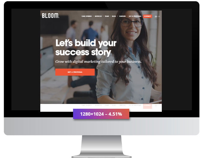
Market research on Most Common Desktop Screen Resolution WorldWide




Market research on Most
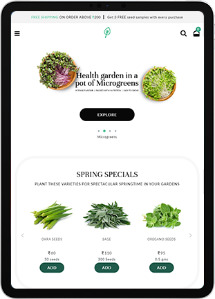
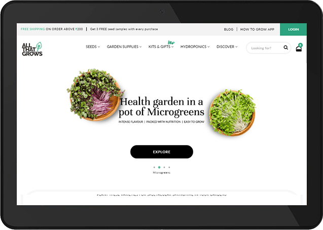
Common Tablet Screen
Resolution WorldWide
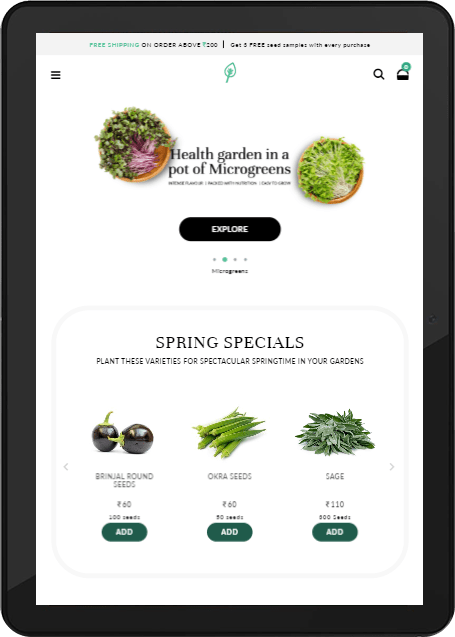



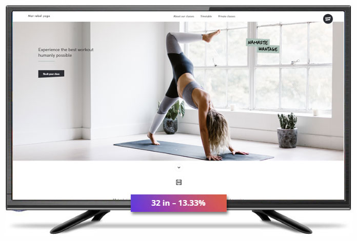
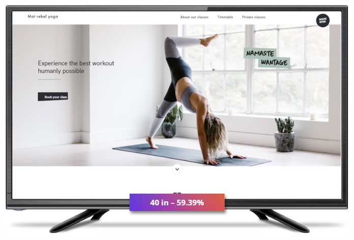
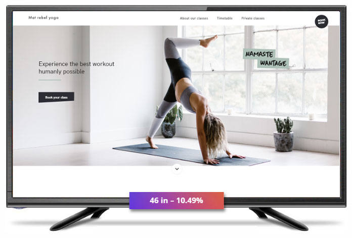
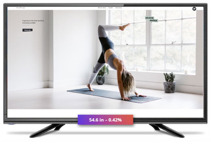
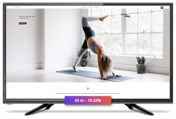
Market research on Most Common Television Screen Resolution WorldWide

Why a responsive website is better than a mobile one?
The main feature of a responsive website is that it adapts with the device being used to access it easily without any problem. The website will adjust the layout content with the visitor’s screen size automatically. The following are the reasons why responsive website is better than a mobile one:
- With the responsive websites every device works effectively in an emphatic manner and moreover it is available on every website pages effectively as well.
A responsive website loads a way faster than that of a mobile site. - According to the Google report, a website that takes more than 3 seconds to load, most of the users just leave it off for another thing.
- Responsive website is less time consuming and is more effective than a mobile website.
M.Dot
URL:
Minimum of of two URLs
PERFORMANCE:
Slower initial load times due to redirect
APP-LIKE FEATURES:
Doesn’t support app-like features on mobile web
Responsive
URL:
One URL
PERFORMANCE:
Absence of proxy server results in faster performance
APP-LIKE FEATURES:
Doesn’t support app-like features on mobile web
The Concept of Responsive Web Design
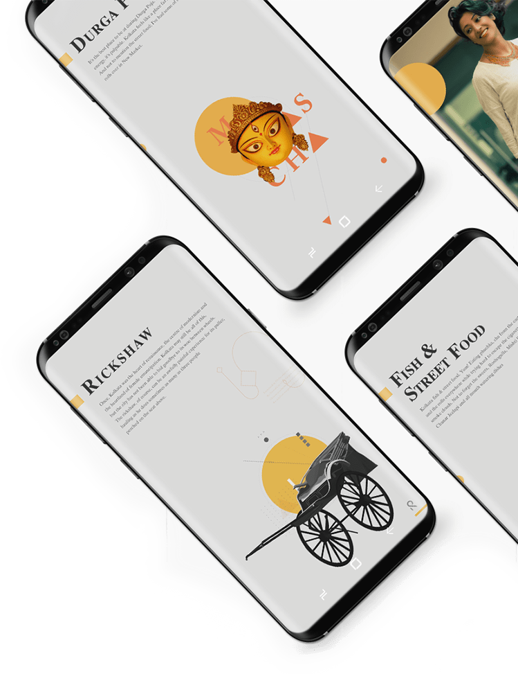
Responsive web design basically is a web development that creates and contributes with the dynamic changes in the appearance of the website altogether. Responsive web design is an approach to design for many devices available to users. Responsive web design takes care of the devices right from the tiny phones to desktop monitors. Indi IT takes care of the responsive web design with a particular attention and we use this discipline into web designing emphatically to make the customers satisfied. One of the special features of this RWD is that it adjusts according to every device.
A more abstract way of thinking is required by responsive web design. Fluid layouts, media queries, and scripts which can reformat web pages and mark up effortlessly as some ideas are already being practiced.
Moreover, it is a whole new way of thinking about designing and at the same time along with being adjustable screen resolutions and automatically resizable images, and it looks really amazing and a great boon for the customers as well.
Adjusting the Screen Resolution
The image on your computer screen or any other device is built up from thousands or millions of pixels altogether and it is the screen resolutions that tells you how many pixels your screen can display horizontally as well as vertically. The screen resolutions vary according to the devices along with the definitions and orientations as well. Each of these devices can handle the variations in size, functionality, and even color as new devices with new screen sizes are also developing everyday in the market. The screen sizes can vary according to the devices, they can be completely square, some could be in landscapes, and the others could be in portrait simultaneously. There are many new devices as well that are able to switch from portrait to landscape at the user’s whim. This availability can be easily availed with the rising popularity of the I-phone, I-pad, and advanced smart-phones as well.
We should always keep in mind before considering hundreds of different screen sizes in addition to designing for both landscape and portrait. Moreover, make sure you design as flexible as possible for each of them, so that it is also possible to group them into major categories as well.
Indi IT looks forward eagerly to help you out with this screen resolution concern with our professional team and our team can take care of this issue easily and emphatically.
Get Flexible Design
There were times when flexible layouts were almost considered a luxury for the websites. But with the time on, concerns came there as well. When these flexible layouts are pushed enough, the flexible structural elements break a layout’s form as images could easily break layouts.
The flexible designs can give a few hundred pixels easily but they often are not able to adjust from a large computer screen to a notebook as these designs are not that flexible.
Now, at present, things have been changed tremendously, what used to happen, is no more a concern now. The things are way more flexible now. Indi IT takes care of this issue with the workarounds so that the layouts never break and images can be adjusted automatically. This solution has given far more options to the digital industry though it is not as complete as it should be. This solution is perfect when a user wants to switch from a portrait orientation to a landscape in an instant such as you can switch from a large computer screen to an I-pad easily.
There are various techniques for creating fluid images as creating fluid grids is fairly a common practice nowadays as well. These techniques can be used in:
· During hiding and revealing portions of the images.
· During the creation of sliding composite images as well.
· During foreground images that scale with the layout.
It is not like plugging in and plugging out for these features on the other hand this technical perspective is easily available nowadays.
The thinking that makes responsive web design absolutely effective and from that point of view a layout can become too narrow or too short to look absolutely right.
Flexible Images
To work with the images, is a major problem and that can be solved with the responsive web design easily and there are various techniques to re-size the images proportionally as well.
Every image loads in its original size unless and until the viewing area becomes narrower than the image’s original width and it stays there as long as no other width-based image style over rides this rule. When it becomes hundred-percent narrower so does the image, as the maximum width of the image is set to be hundred-percent of the screen or the browser width.
The basic idea behind the fluid image is to deliver the images at the maximum size in which they will be used. You allow the browser to re-size the images required and on using CSS to guide their relative size when you do not declare the height and width in your code. This is a simple technique to resize the images beautifully.
A good use of width which is hundred-percent would solve the problem neatly in an IE as the max-width is not supported in the IE. The rendering is not clear as well as it should be which is also an one more issue when an image is resized too small in the some old browser in Windows.
The download times should be the main point to consider while the above is a great quick fix and a good start to responsive images, image resolutions, and the download times. At the same time, if the original image size is meant for the large devices, it could significantly slow the download times and can take up space unnecessarily on the other hand re-sizing an image for mobile devices is very simple.


Responsive images of filament groups
This technique is presented by the Filament Group and it takes the issue into consideration and not only resizing the image proportionally but also shrinks the image resolution on the smaller devices as well so that the large images do not waste space unnecessarily on the smaller screens.
This technique is used and fully supported in these modern browsers such as IE8 +, Safari, Chrome, and Opera as well as in mobile devices that use these browsers as well. It is always expected of a responsive image and the resolutions are downloaded together so that the end benefit of saving space with this technique is void as the older browsers and Firefox degrades them nicely.
Stopping iPhone simulator image resizing
Any problem associated working with the images is always solved with the responsive web design. Moreover, there are various techniques to resize images proportionally as well.
Every image will load in its original size unless the viewing area becomes narrower than the image’s original width as long as no other width-based image styles over rides this rule. When it becomes 100% narrower so does the image, as the maximum width of the image is set to 100% of the screen or the browser width.
Delivering the images at the maximum size in which they will be used at is what the idea behind these fluid images. You allow the browser to resize the images required while using CSS to guide their relative size as you do not declare the height and width in your code. It is one of the simple techniques used to resize the images beautifully.
A good use of width which is 100% would solve the problem neatly in an IE as the max-width is not supported in the IE. The rendering is not as clear as it ought to be and that is a one more issue when an image is resized too small in some older browsers in Windows. The download times should be the primary considerations while the above is a great quick fix and a good start to responsive images, image resolution and the download times. If the original image size is meant for the large devices, it could significantly slow the download times and take up space unnecessarily while resizing an image for mobile devices can be very simple.

Custom Layout Structure
If you are looking for the extreme size changes, one may change the layout altogether either through a separate style sheet or more efficiently through a CSS media query. Most of the style can remain the same and simultaneously specifying style sheets can inherit these styles and move the elements around with floats, width, heights, and so on.
Showing or Hiding Content
If you re-arrange the elements to make everything fit as a screen gets smaller, it is possible to shrink things proportionally as well. Make every piece of content on the large screen available on the small screen as well. Except this, mobile device is not the best answer to do so. From mobile point of view, we have the best practices such as lists or rows instead of multiple columns, focused content, and simpler navigation etc.
Regarding a wide range of platforms and screen sizes, a responsive web design should not be just about how to create a flexible layout. The user must be able to pick and choose the content and it should be like this.

Why a responsive website is better than a mobile one?
Responsive Data Tables
We as Indi IT, here reformat the table for better readability. Pie graph is another way to show relative size of data and can be said another way of displaying. Adapting with the table into a mini-graphic for the narrow screen and when the full table is displayed it does not interfere much with the content as well.
CSS Transitions and Media Queries
Here we use media queries effectively to design responsive websites that adapt in the layout according to the browser’s width, and you can constantly resize your browser to see how the website performs finally.
Responsive Navigation Menus: Converting a Menu to a Dropdown for Smaller Screens
Touchscreens vs. Cursors
They are very well-known and abundantly coming in to use as well. Many laptops and desktops are also having touch screen facilities in the market and one can say that they are not only limited to the smaller devices only.
Both of them have different capabilities. The touch screen comes with the different design guidelines than purely cursor-based interaction. Moreover, it does not require a lot of time for making a design which works for both. On the other hand, the touch screen has no capability to display CSS hovers. Besides, they are considered as an additional feature only for the cursor-based devices, only to avoid the complete reliability on the CSS hovers for link definitions.


